BRAND IDENTITY
Crystal Bridges Museum
of American Art
SCOPE OF WORK INCLUDED
Design, Art Direction, Brand Style Guidelines
BRAND IDENTITY
Crystal Bridges Museum
of American Art
SCOPE OF WORK INCLUDED
Design, Art Direction, Brand Style Guidelines
BRAND IDENTITY
Crystal Bridges Museum
of American Art
SCOPE OF WORK INCLUDED
Design, Art Direction, Brand Style Guidelines
BRAND IDENTITY
Crystal Bridges Museum
of American Art
SCOPE OF WORK INCLUDED
Design, Art Direction, Brand Style Guidelines
BRAND IDENTITY
Crystal Bridges Museum of American Art
SCOPE OF WORK INCLUDED
Design, Art Direction, Brand Style Guidelines
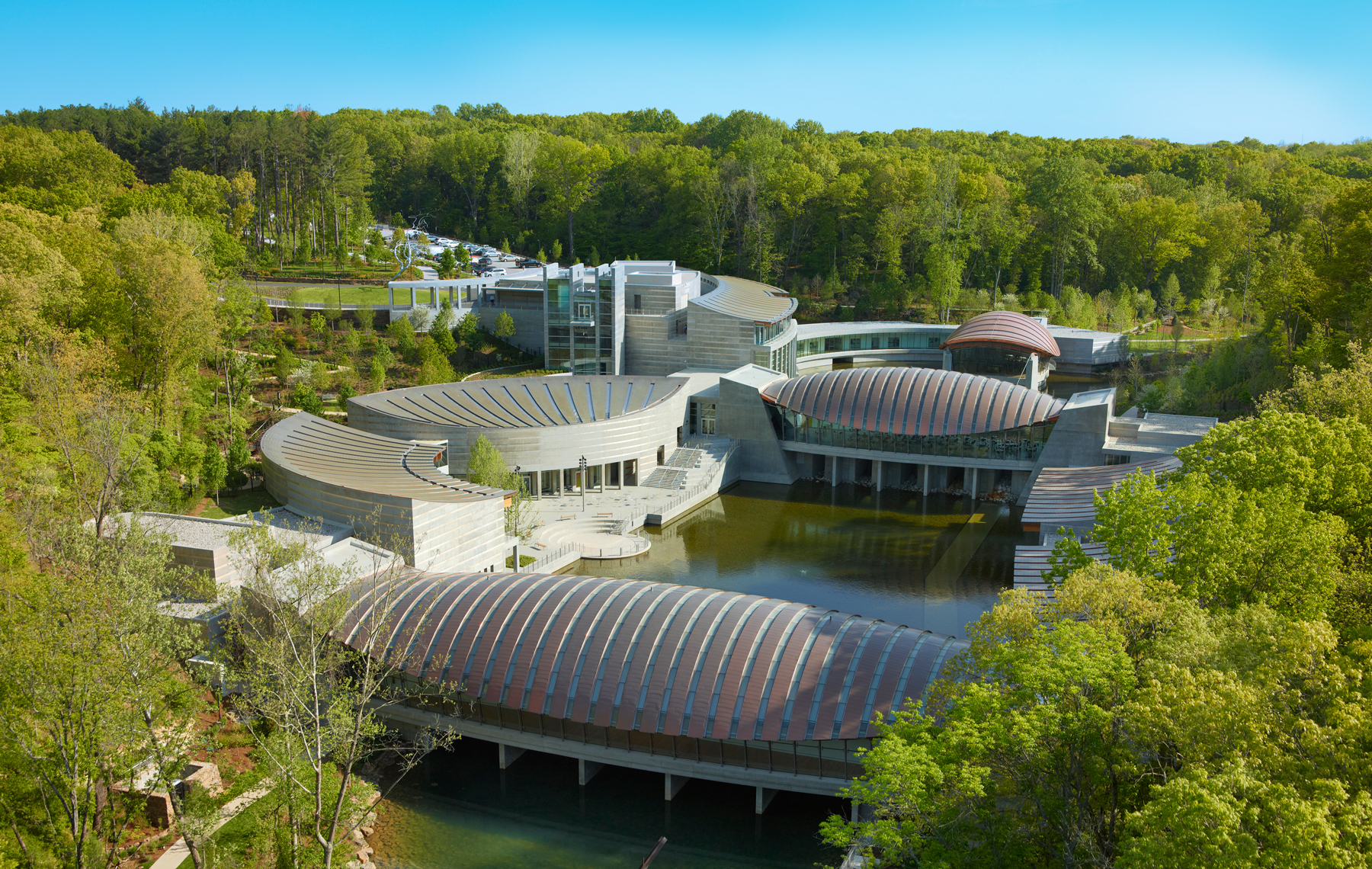
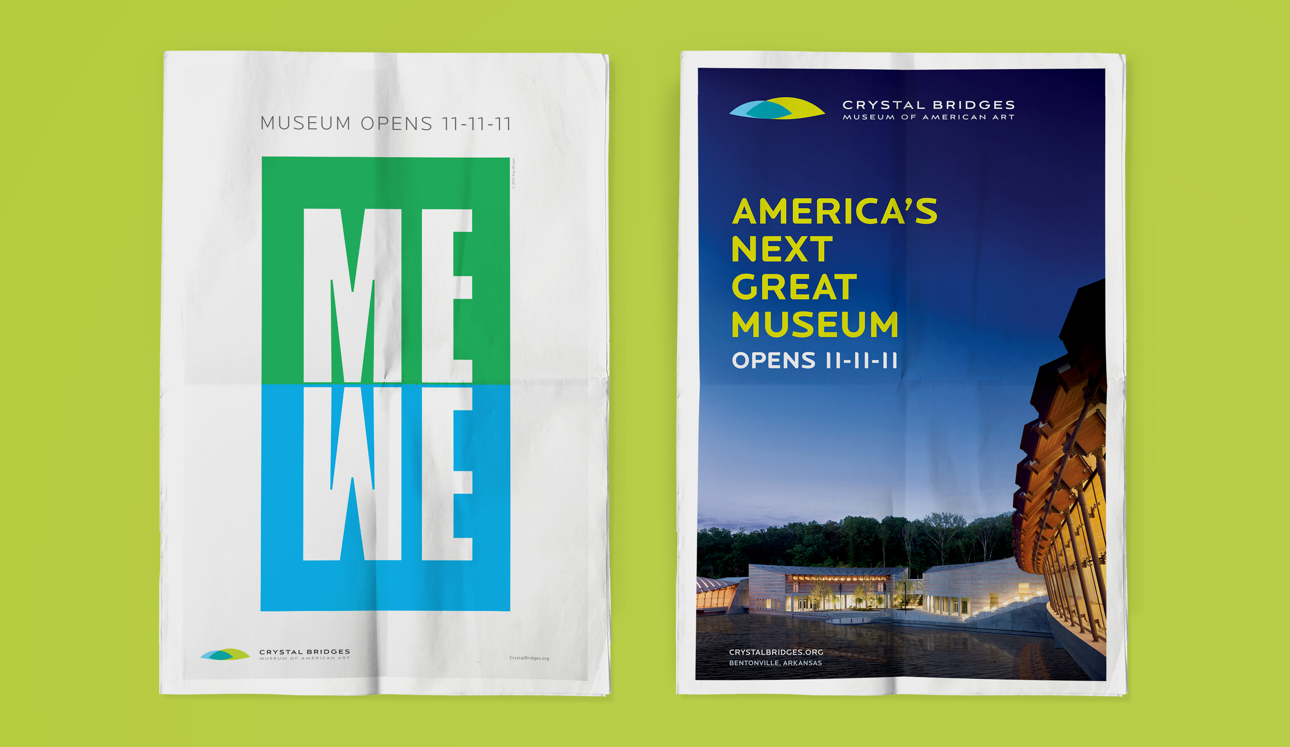
Nestled within 120 acres of beautiful Ozark landscapes, the Crystal Bridges Museum of American Art is known for its ever-growing permanent collection of American art that spans from colonial times to the present day. When it opened its door in Bentonville, Arkansas in 2011, the Museum faced fundamental decisions about its market position and brand identity. The challenge upon its opening was how to introduce itself to cultural consumers as well as non-traditional audiences, and how to generate excitement locally and across the nation.
Guided by Insights gained through strategic visioning sessions, the Museum’s brand positioning and messaging centered on its most compelling offering: a unique blend of art, architecture, and nature.
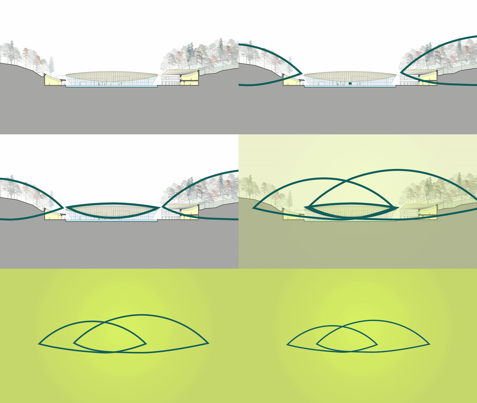
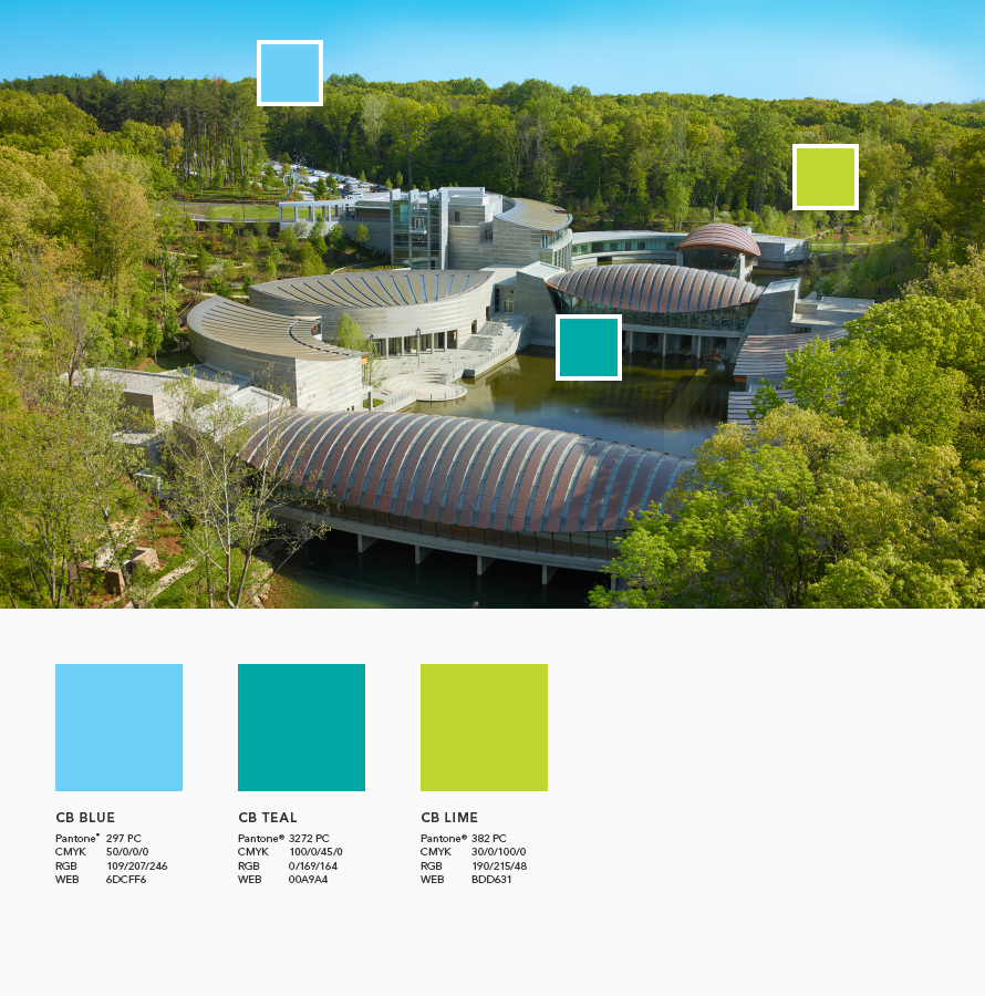
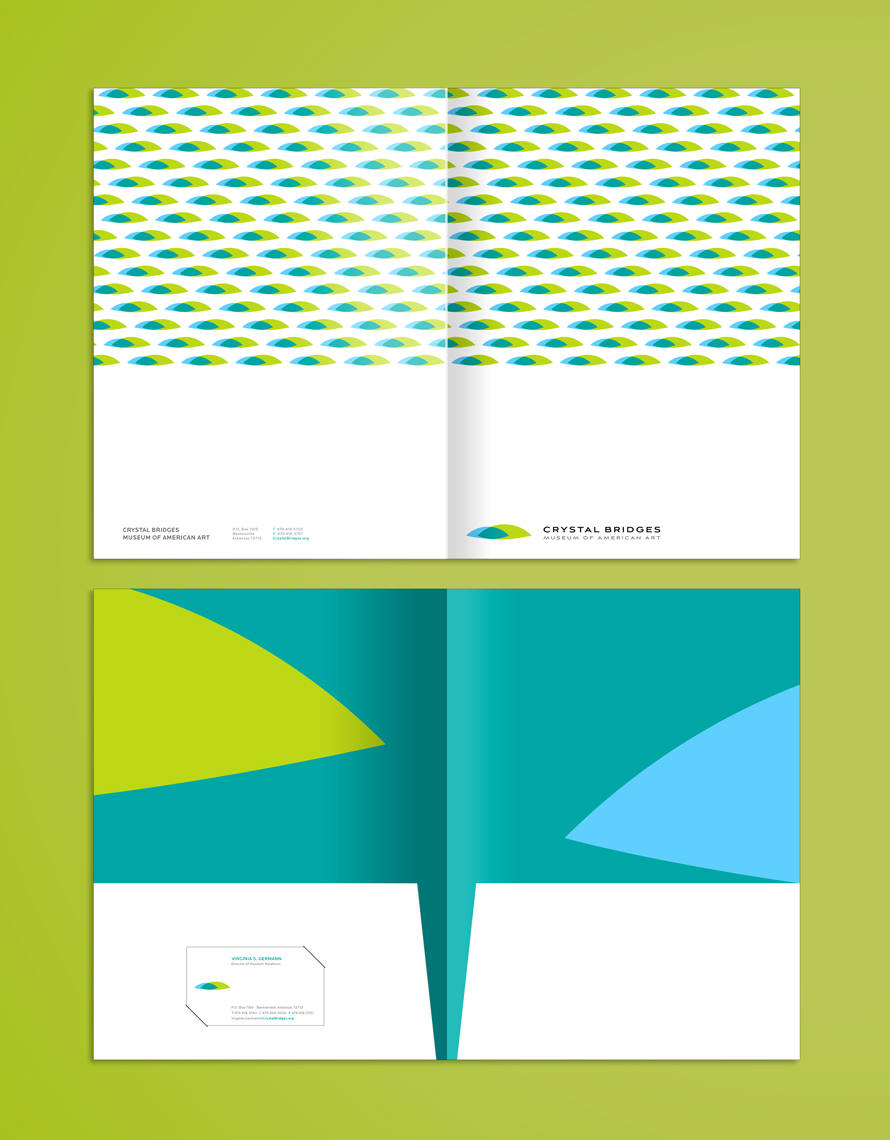
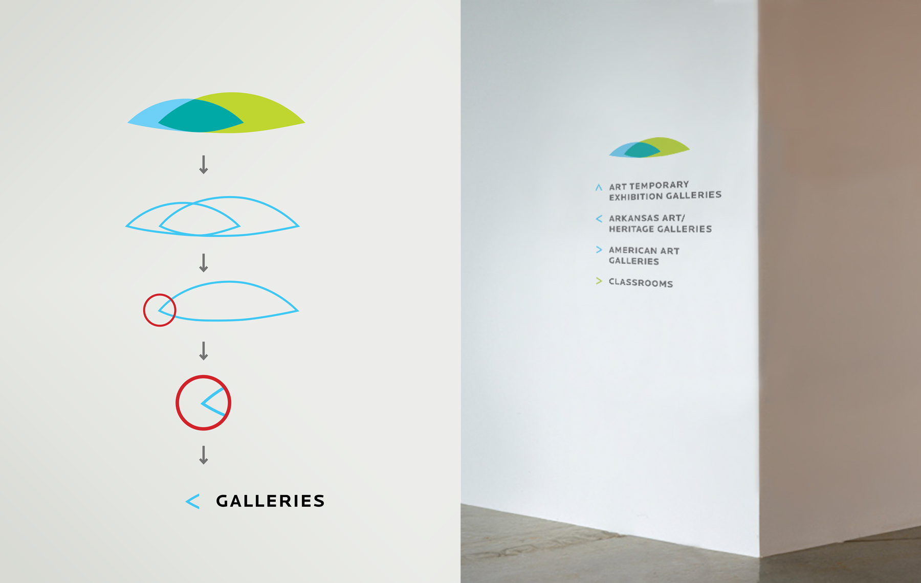
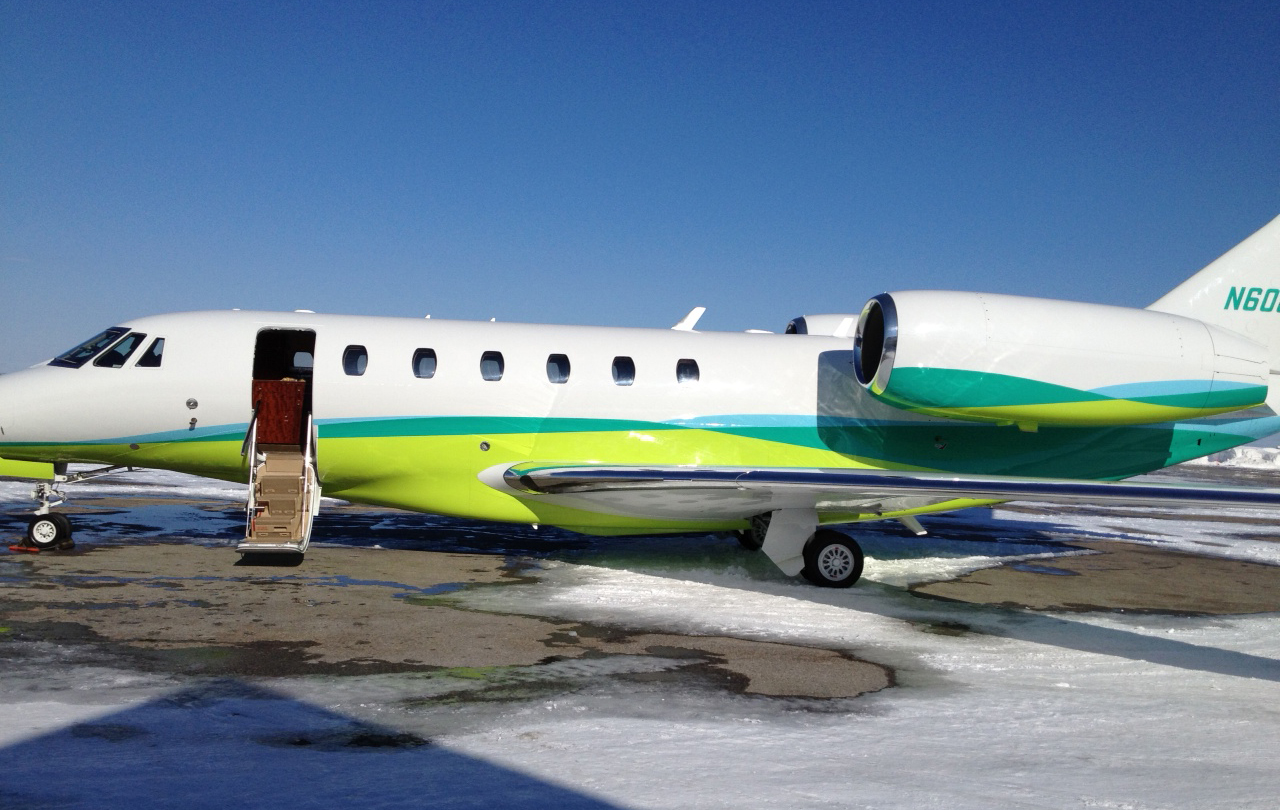
To create the institution’s visual identity, it was integral to focus on key elements that define the site’s uniqueness: the power of art, the astounding architecture, and the beauty of nature. The visual identity integrates three organic shapes and colors that symbolize these key elements.
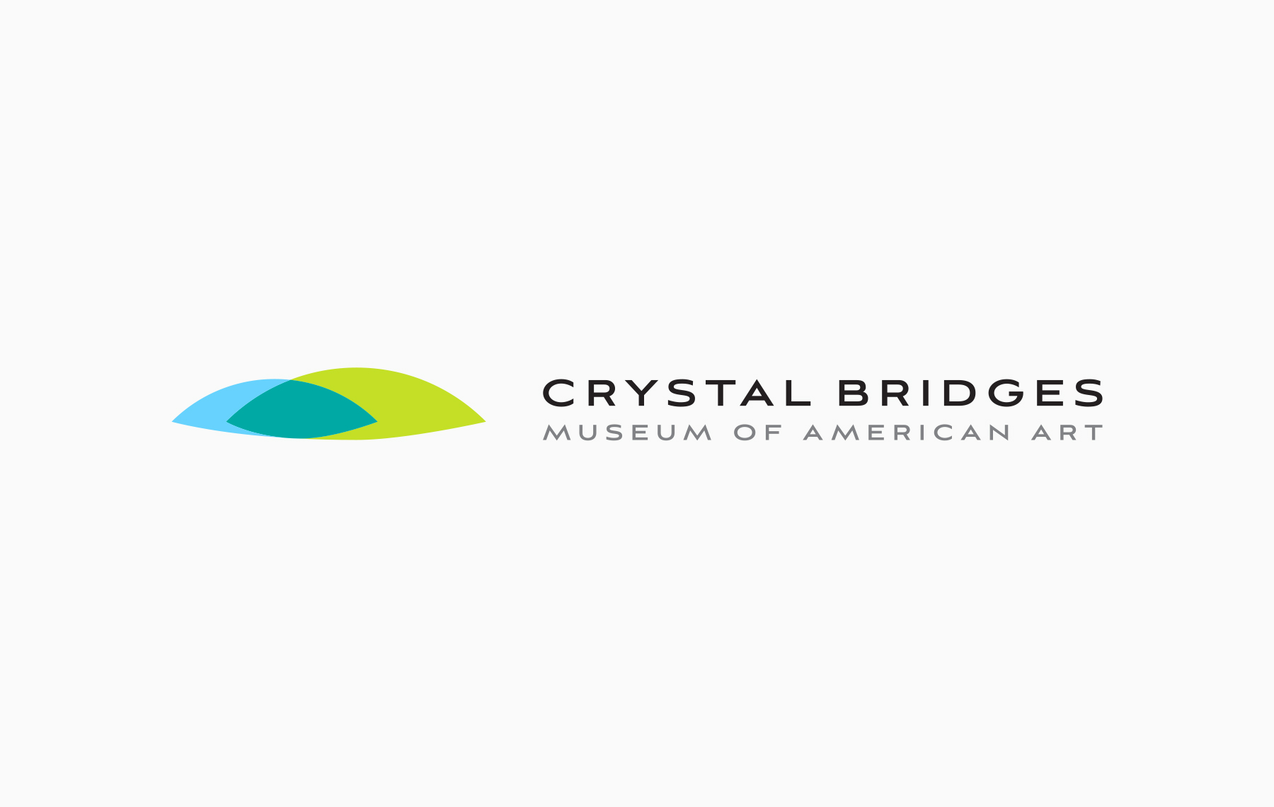
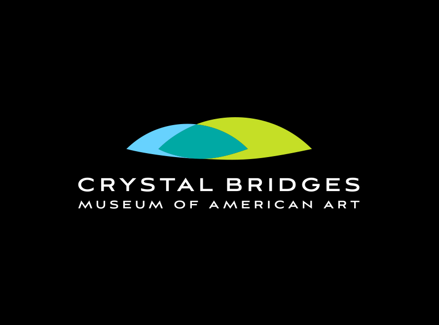
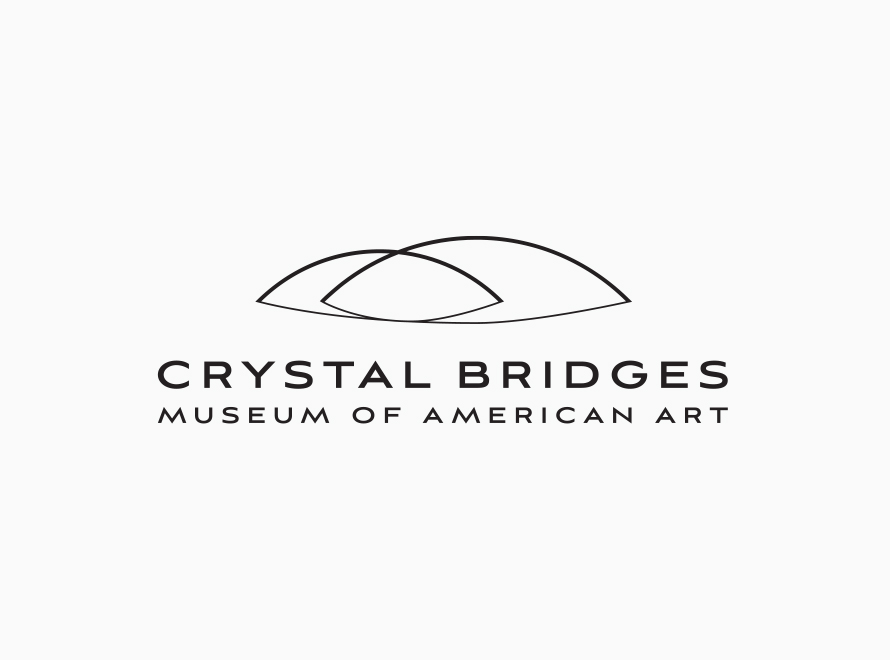
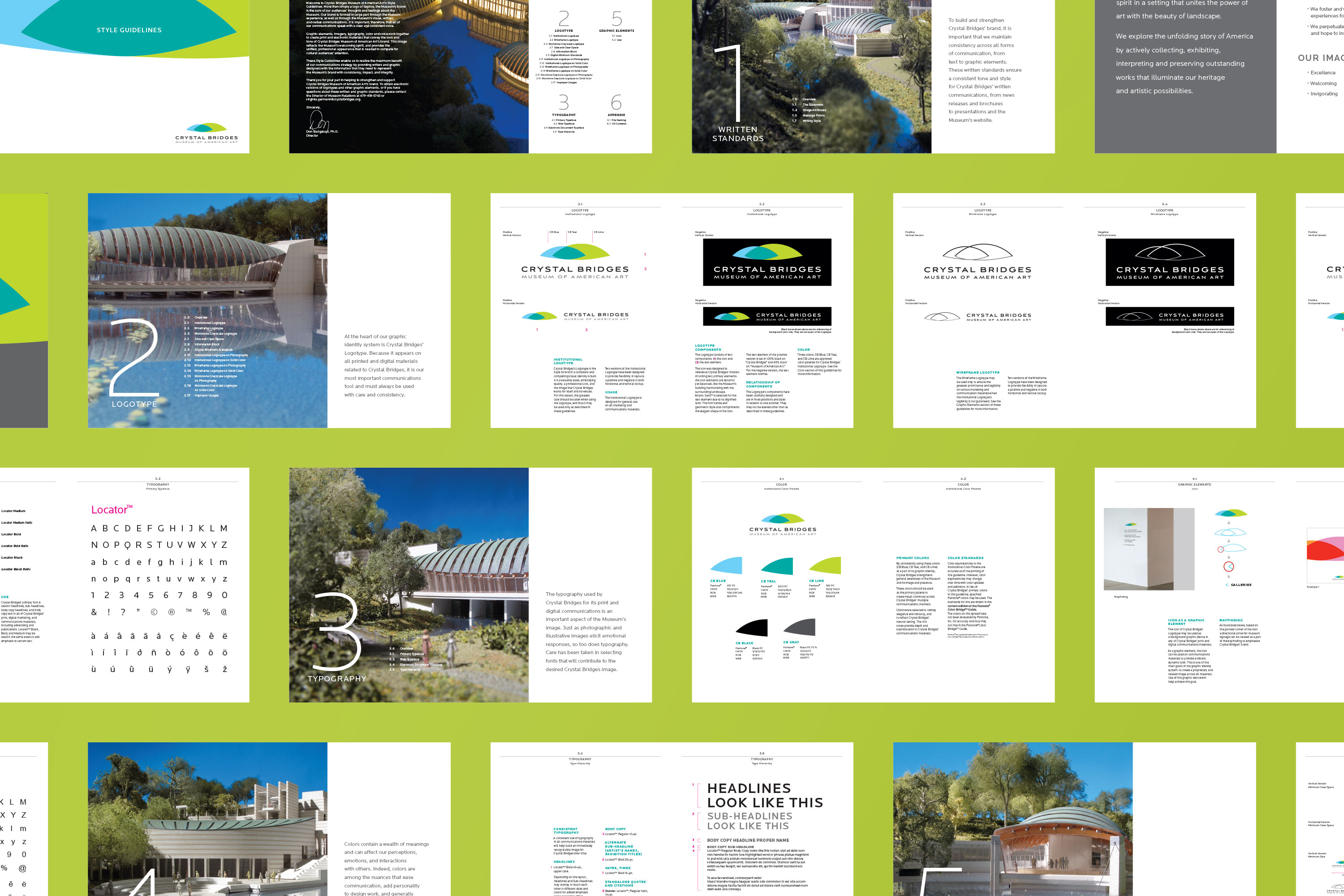
Aviano Sans™ was selected for the word mark due to its dignified look. The typeface’s wide and geometric form also compliments the elegant shape of the mark. Locator™ was selected as a primary font for the Crystal Bridges brand. The typeface’s tight and clean lines make it one of the most legible typefaces. Its squared edges with the structure of each letter being more horizontal rather than vertical, is comparable to Aviano Sans™ used in the wordmark. Furthermore, Locator™’s modern and refined presence nicely complements Aviano Sans™’s geometric form.
Aviano Sans™ was selected for the word mark due to its dignified look. The typeface’s wide and geometric form also compliments the elegant shape of the mark. Locator™ was selected as a primary font for the Crystal Bridges brand. The typeface’s tight and clean lines make it one of the most legible typefaces. Its squared edges with the structure of each letter being more horizontal rather than vertical, is comparable to Aviano Sans™ used in the wordmark. Furthermore, Locator™’s modern and refined presence nicely complements Aviano Sans™’s geometric form.
Aviano Sans™ was selected for the word mark due to its dignified look. The typeface’s wide and geometric form also compliments the elegant shape of the mark. Locator™ was selected as a primary font for the Crystal Bridges brand. The typeface’s tight and clean lines make it one of the most legible typefaces. Its squared edges with the structure of each letter being more horizontal rather than vertical, is comparable to Aviano Sans™ used in the wordmark. Furthermore, Locator™’s modern and refined presence nicely complements Aviano Sans™’s geometric form.
Aviano Sans™ was selected for the word mark due to its dignified look. The typeface’s wide and geometric form also compliments the elegant shape of the mark. Locator™ was selected as a primary font for the Crystal Bridges brand. The typeface’s tight and clean lines make it one of the most legible typefaces. Its squared edges with the structure of each letter being more horizontal rather than vertical, is comparable to Aviano Sans™ used in the wordmark. Furthermore, Locator™’s modern and refined presence nicely complements Aviano Sans™’s geometric form.
Aviano Sans™ was selected for the word mark due to its dignified look. The typeface’s wide and geometric form also compliments the elegant shape of the mark. Locator™ was selected as a primary font for the Crystal Bridges brand. The typeface’s tight and clean lines make it one of the most legible typefaces. Its squared edges with the structure of each letter being more horizontal rather than vertical, is comparable to Aviano Sans™ used in the wordmark. Furthermore, Locator™’s modern and refined presence nicely complements Aviano Sans™’s geometric form.


ryz
r y z
r y z
r y z
ryz
r y z