CAMPAIGNS & VISUAL ARCHITECTURE
The Metropolitan Museum
of Art
SCOPE OF WORK INCLUDED
Design, Art Direction, Motion Graphics
CAMPAIGNS & VISUAL ARCHITECTURE
The Metropolitan Museum of Art
SCOPE OF WORK INCLUDED
Design, Art Direction, Motion Graphics
CAMPAIGNS & VISUAL ARCHITECTURE
The Metropolitan Museum of Art
SCOPE OF WORK INCLUDED
Design, Art Direction, Motion Graphics
CAMPAIGNS & VISUAL ARCHITECTURE
The Metropolitan Museum of Art
SCOPE OF WORK INCLUDED
Design, Art Direction, Motion Graphics
CAMPAIGNS & VISUAL ARCHITECTURE
The Metropolitan Museum
of Art
SCOPE OF WORK INCLUDED
Design, Art Direction, Motion Graphics
The Metropolitan Museum of Art is one of the most visited art museums in the world. In his 10+ years working with the museum, Ryo led the efforts of creating several major institutional campaigns, countless exhibition advertisements, and evolved and refined their design system that is adaptable, scalable, and coherent across the museum’s marketing outputs.
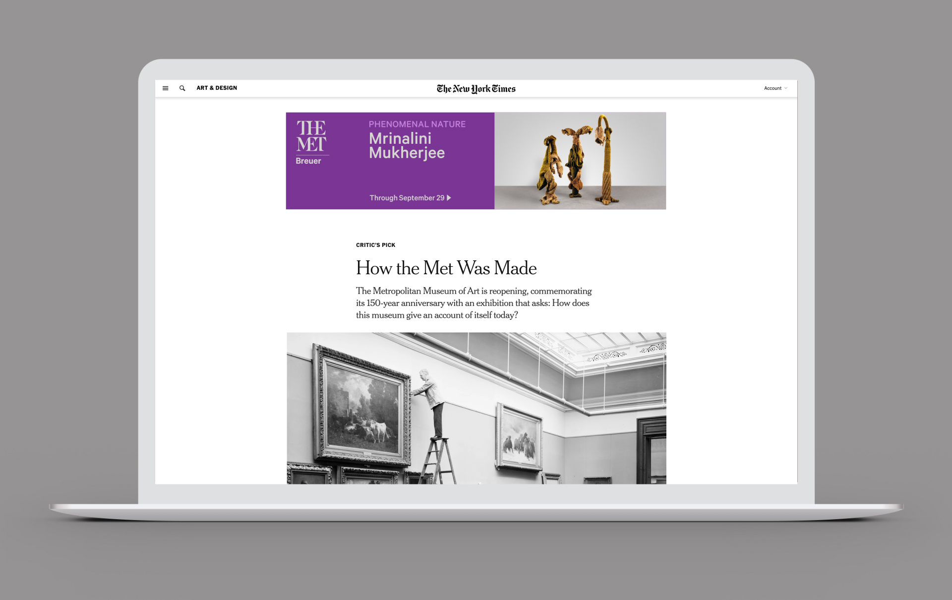
Providing exciting and unique ways to activate the Met’s offerings to draw in even larger and more diverse audiences was the key goal. When the Met evolved its communication strategy in 2018, refining the brand visual architecture was needed. Previously on the Met exhibition-focused communication, exhibition titles were the highest prioritized element among all information. In the refinement, as the strategy embarked a shift to more institutional driven communication, the coherent, comprehensive, and scalable design system for across various platforms was the primary consideration. The Met’s brand mark became the most prominent visual element, surrounded by plenty of “air” (negative space”) on the page. Placement of the base elements like the institutional mark, image, and messaging brings cohesiveness across all media through scaling and repositioning.
The result is a visual system, creating a systematic approach to how content is structured, and presented. The approach is rational yet accessible, and allows the Met stay on messages.
Ryo has collaborated with the Met’s marketing team to strategize and determine targeted demographics for each show and key visuals. Most shows were advertised in integrated media across select publications, customized digital platforms.
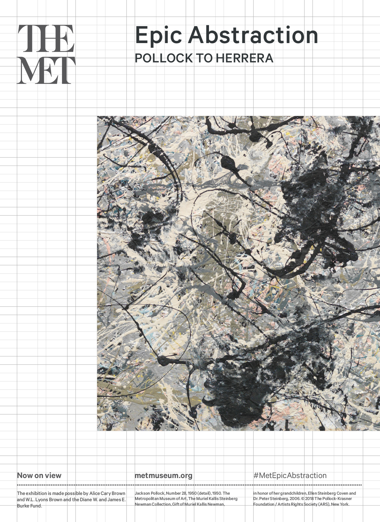
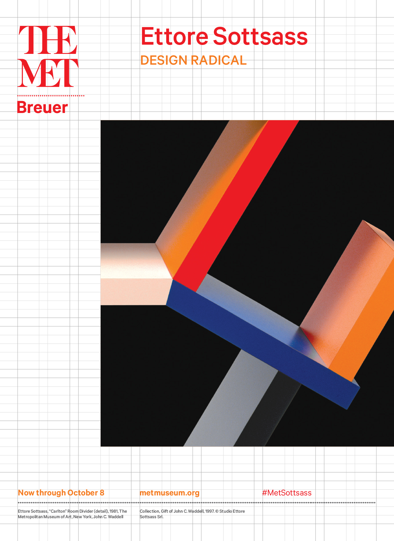
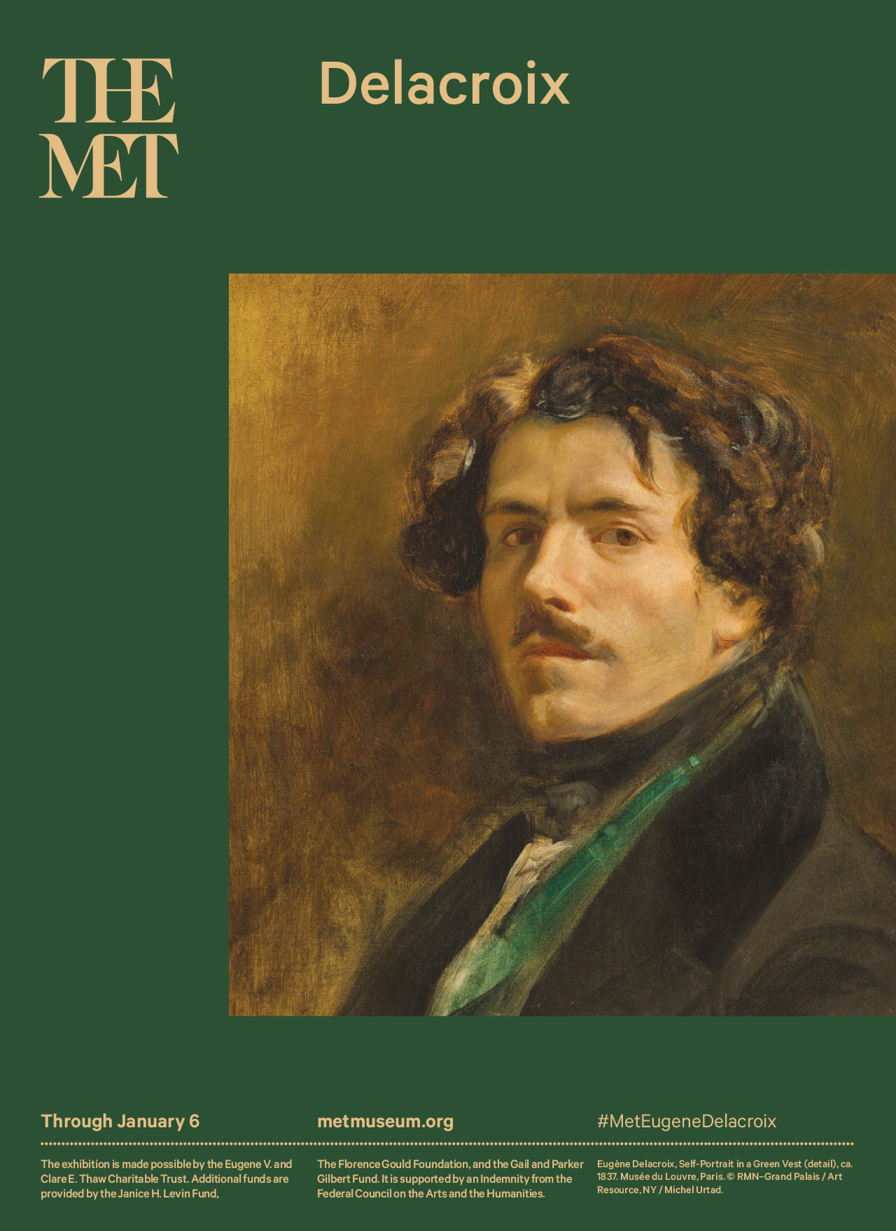
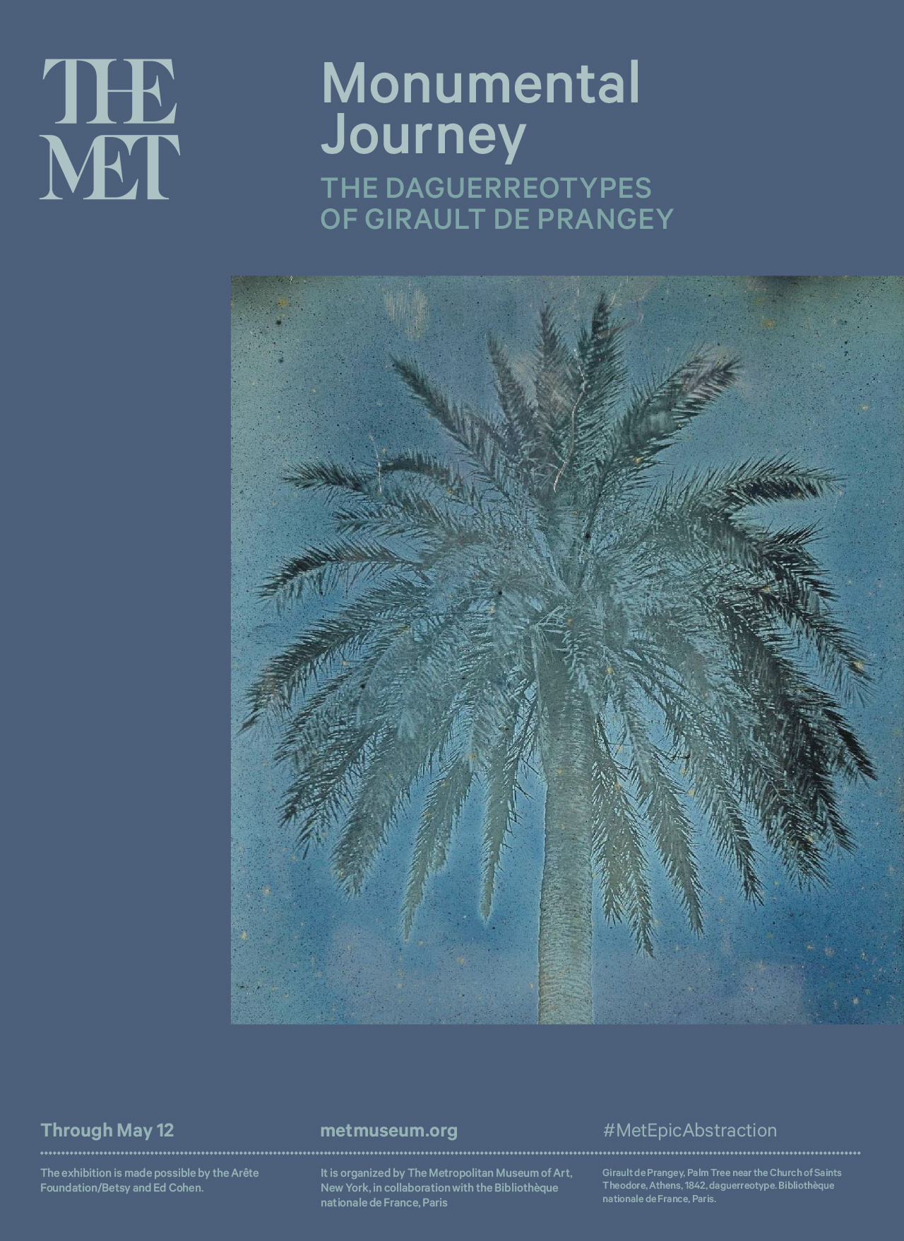
Additionally, all copies including the exhibition titles are set in The Met Sans Medium, the customized version of Calibre by Klim Type Foundry, introduced by Wolff Olins in 2017. The typeface reflects the Met brand expression through its contemporary lens.
Additionally, all copies including the exhibition titles are set in The Met Sans Medium, the customized version of Calibre by Klim Type Foundry, introduced by Wolff Olins in 2017. The typeface reflects the Met brand expression through its contemporary lens.
Additionally, all copies including the exhibition titles are set in The Met Sans Medium, the customized version of Calibre by Klim Type Foundry, introduced by Wolff Olins in 2017. The typeface reflects the Met brand expression through its contemporary lens.
Additionally, all copies including the exhibition titles are set in The Met Sans Medium, the customized version of Calibre by Klim Type Foundry, introduced by Wolff Olins in 2017. The typeface reflects the Met brand expression through its contemporary lens.
Additionally, all copies including the exhibition titles are set in The Met Sans Medium, the customized version of Calibre by Klim Type Foundry, introduced by Wolff Olins in 2017. The typeface reflects the Met brand expression through its contemporary lens.
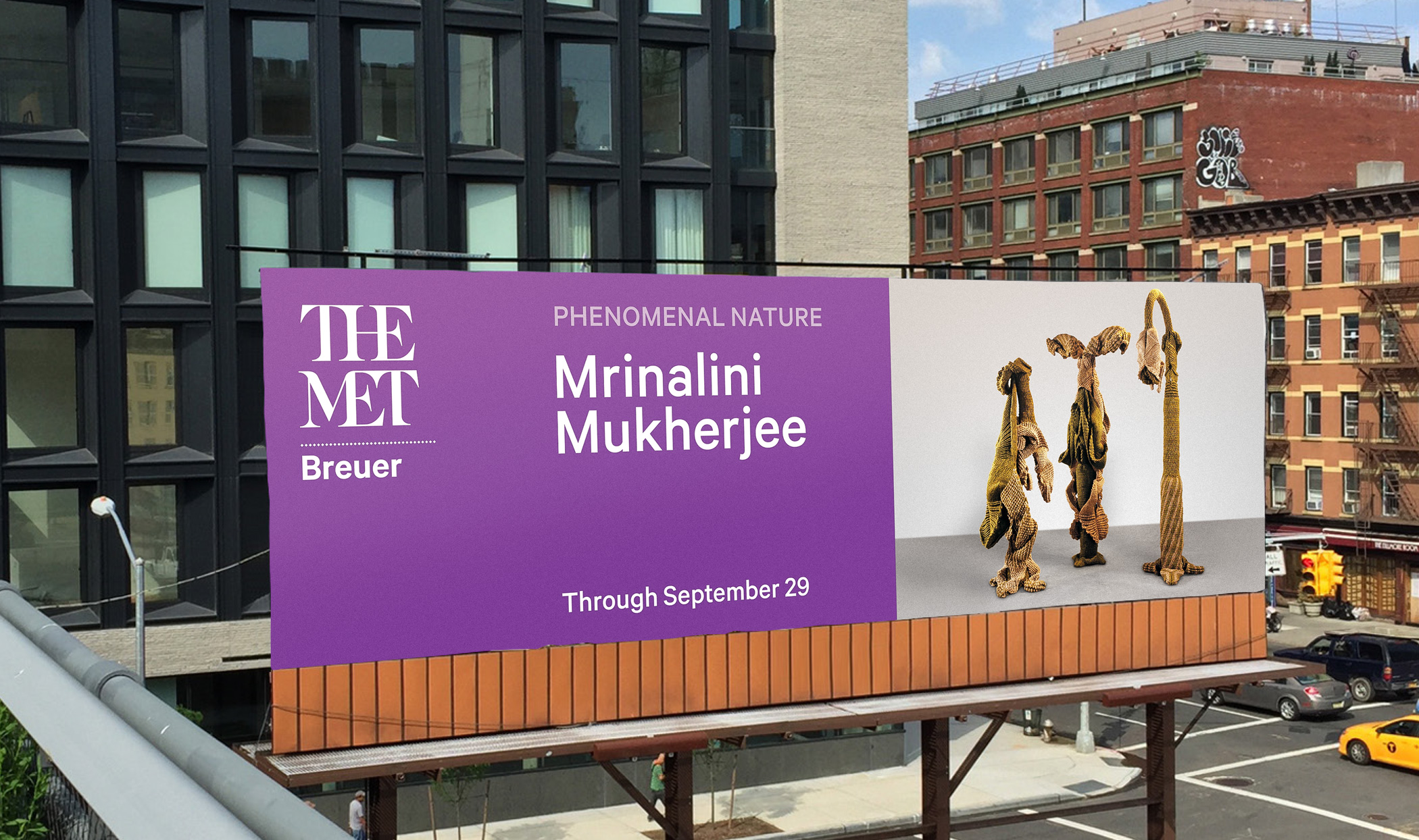
High Line Billboard
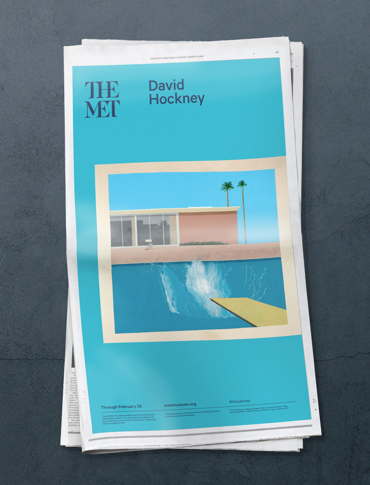
Newspaper Ad
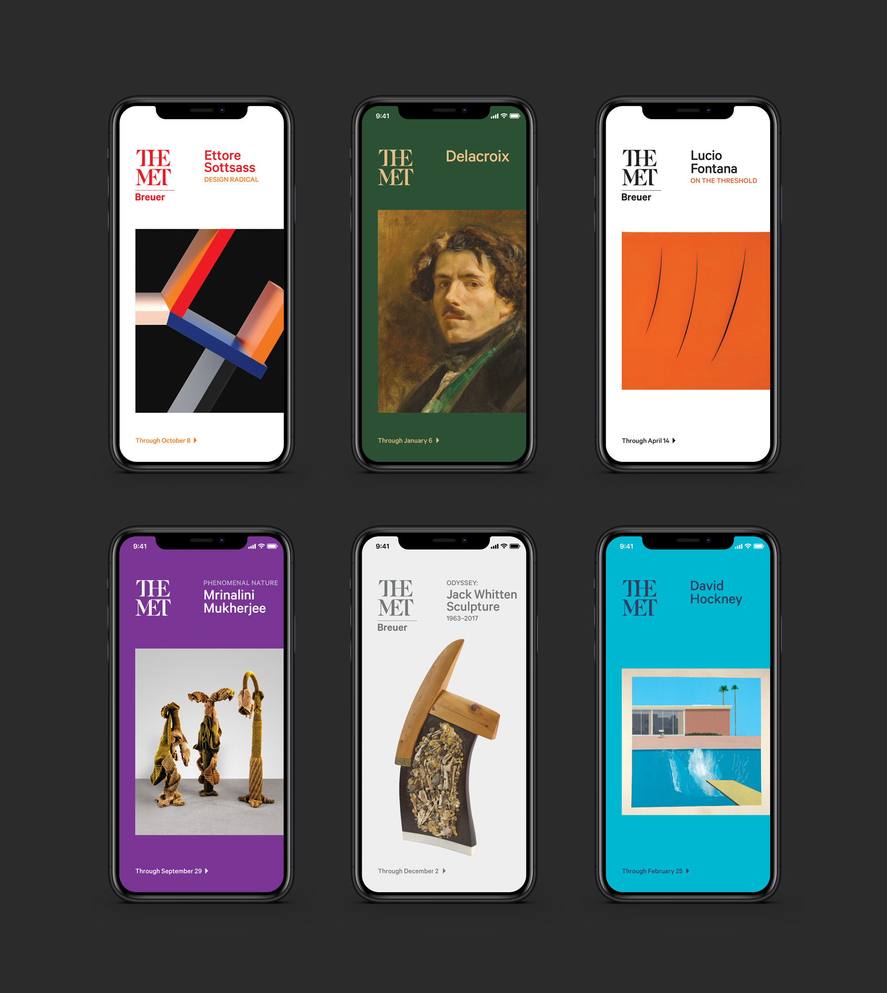
New York Times Digital Ads
ryz
r y z
r y z
r y z
ryz
r y z